Connecting residents at Camelias
Aug 2019 ~ Apr 2020
Goals
Provide a digital alternative to replace the manual paper print process.
Build a zero-cost project for service providers.
Automate data collection to avoid bottlenecks.
Context
Camelias is the given name of a condo where I used to live.
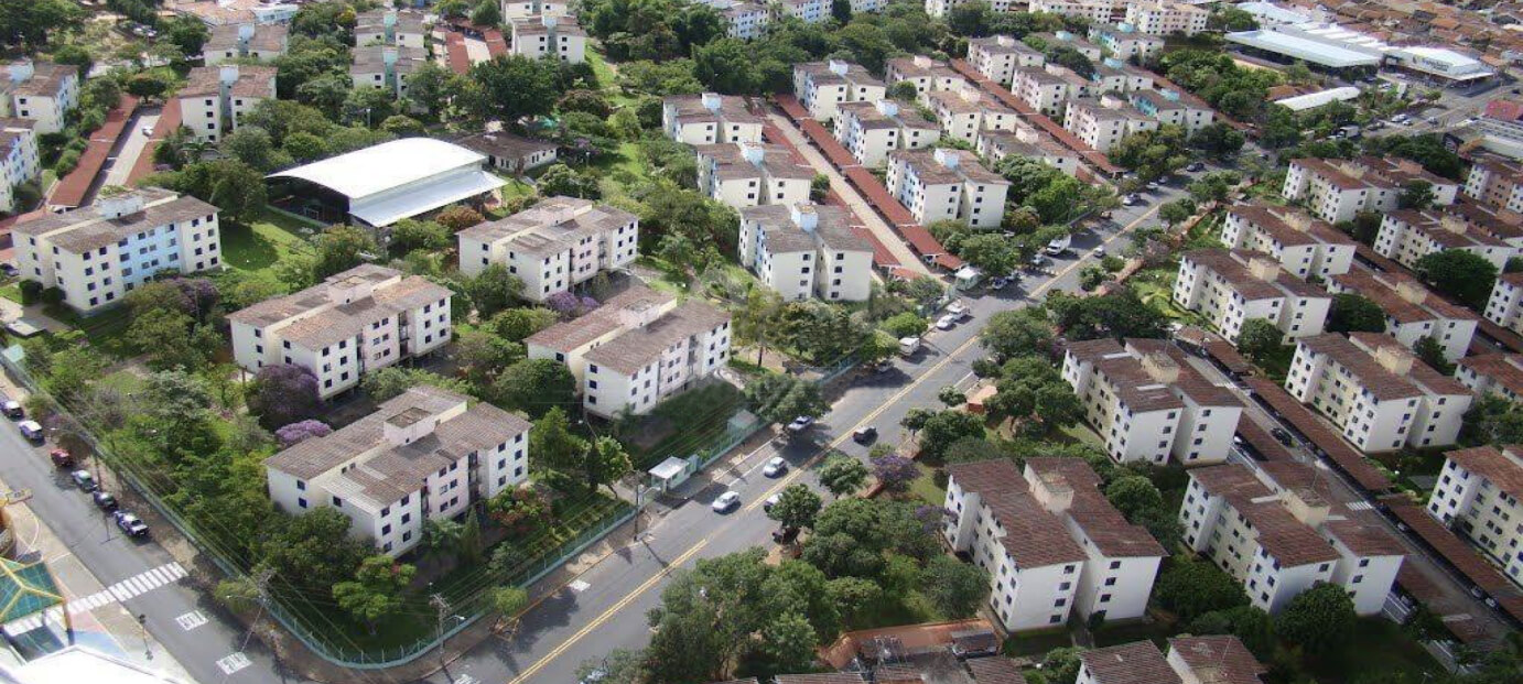
It has 48 buildings, 16 apartments each, with around 2000 people living there, and at the time, 10% of the residents were service providers.
Opportunity
People weren’t very close, so they didn’t know there were some service providers they could request.
When they needed a plumber, for example, the first thing to do was to search on Google and wait for someone that sometimes could take several hours to be there and do the job.
As a remedy, one resident created a Whatsapp group and started to list the name, number, and the services the residents provided in the condo so based on that the receivers in the group could see who could potentially solve their problems nearby.
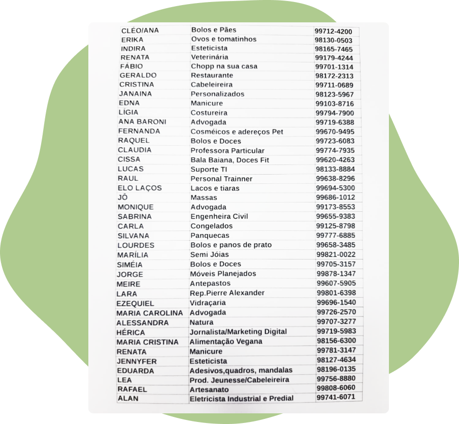
Considering the fact they didn’t have a budget to build something robust, that worked, but they still had to deal with a difficult process:
Add all the info in an Excel spreadsheet.
Print that spreadsheet.
Take a photo of the paper.
Share the photo on Whatsapp group.
Redo all the steps above for every new person to be included.
Discovery
Seeing that, I started to interview some residents and ask for pain points and requests in a way this could be improved. So they told me things like:
Having too many outdated images.
Phone storage was often full due to the size of the photos.
It’s hard to scan the information.
There’s no way to search.
The owner’s availability to update the requests is not ideal.
It would be nice to see more details, such as a website or social media.
I also identified the following data when speaking to the audience:
82% of the service providers aged 24-30
69% of service receivers aged 53-65
76% of the residents were using mobile devices
Their preferred and most used website: Google
References
I’ve explored many alternatives, searching for something that made sense to their context and a UI that could reflect on their expectations.

Ideation
Then, I created simple prototypes to see it in action and get user feedback.
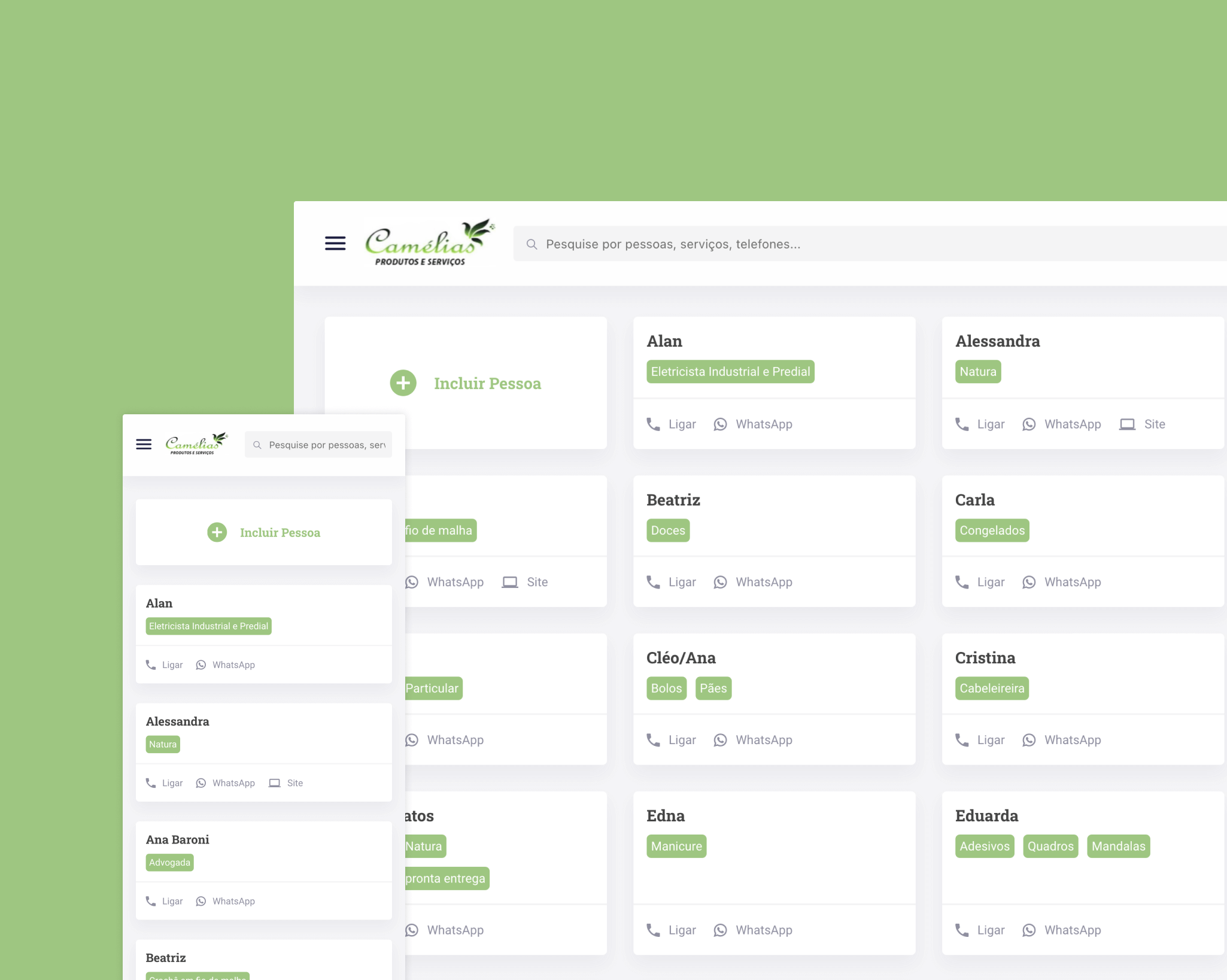
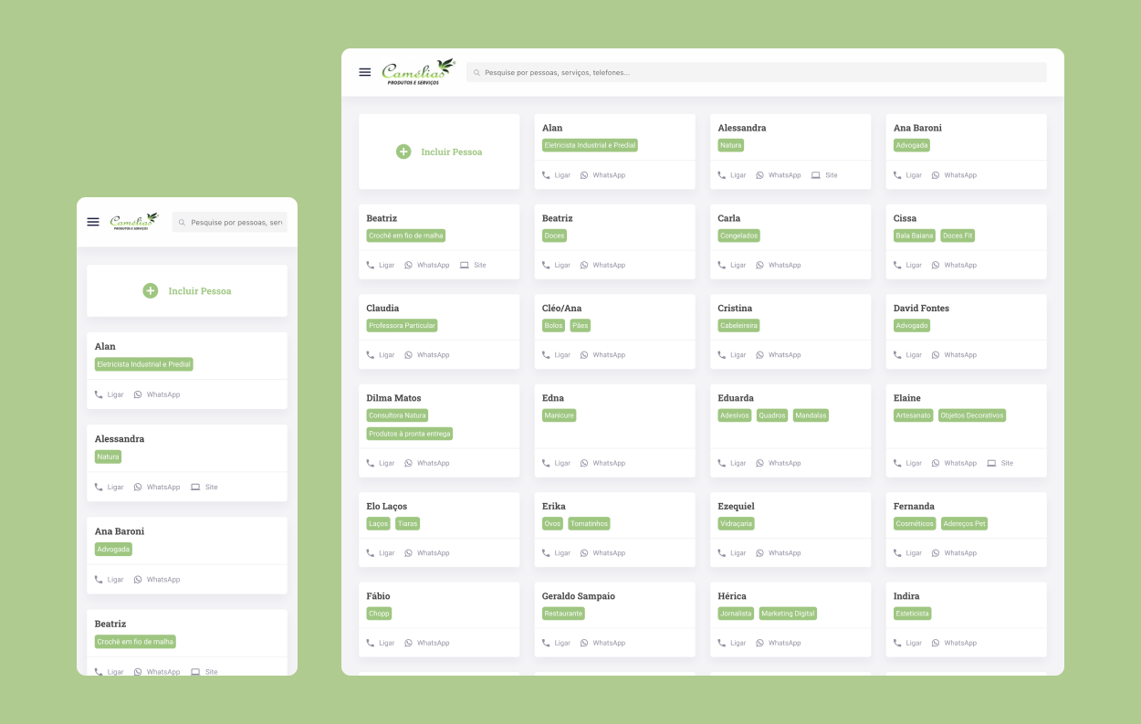
The concept was a page to list the available people with cards, an action button at the top to open a modal where they can fill in their info and send, and a fixed search bar.
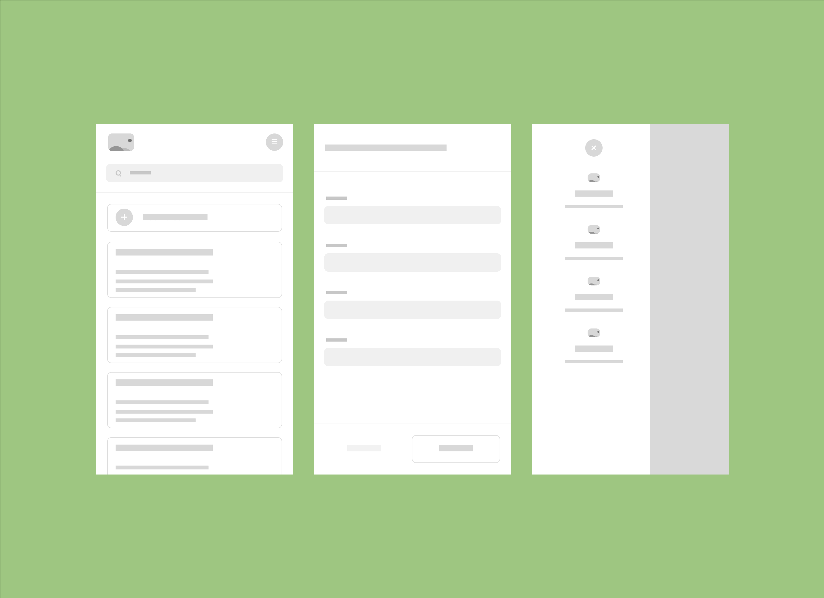
The users approved the concept, so we were able to come up with the final designs.
Each card can show up to 3 tags containing the services the person can provide and an action row where is placed their phone to call, Whatsapp to send a message, and a website link.
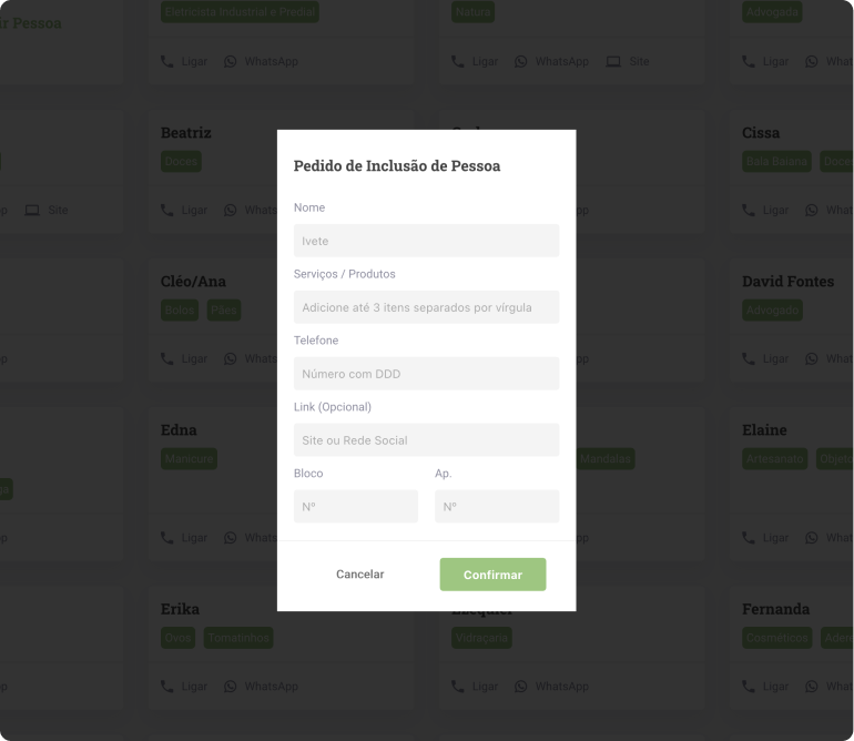
The modal for adding new services is composed of the fields: name, services, phone number, and link.
We also added two required fields to the building and apartment numbers, so we can avoid spammers and people that don’t live there.
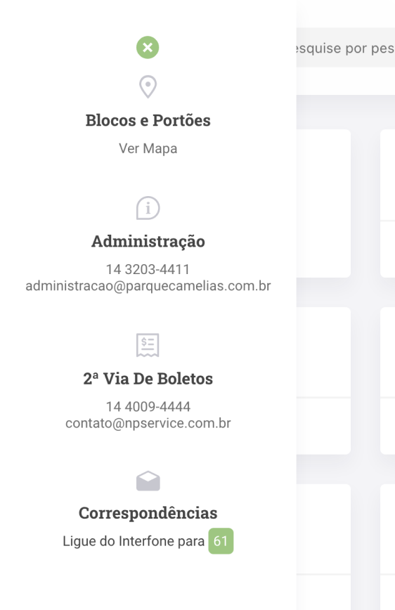
The off-canvas menu is being used to display some helpful information about the condo, like gate numbers, management, postal office, and billing.
Implementing
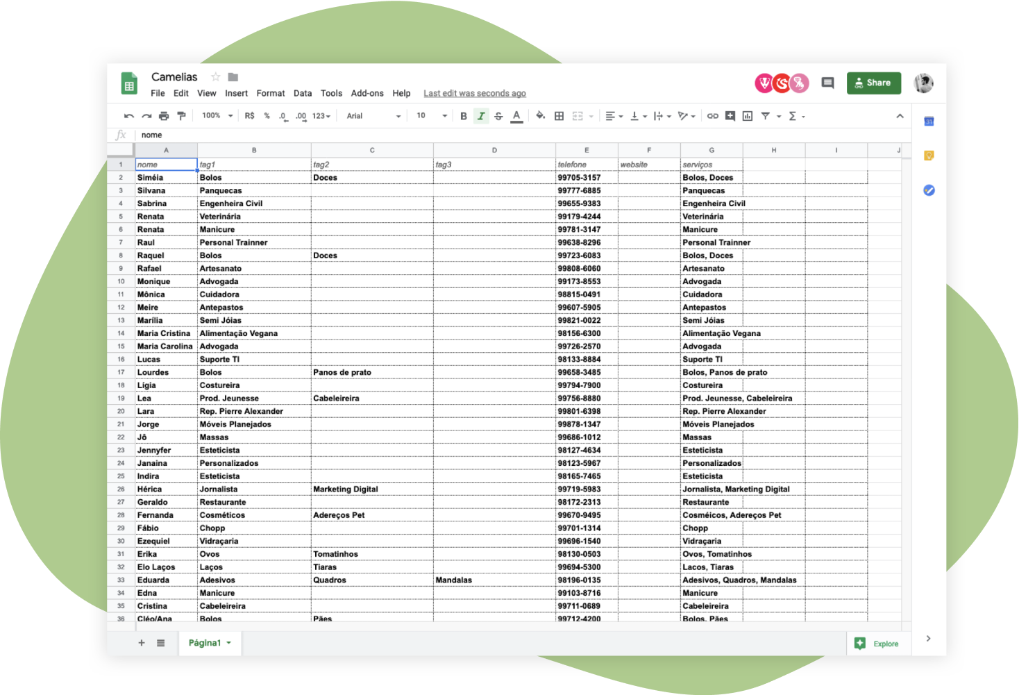
The first step was to improve the Excel file, so we moved to Google Sheets to keep in the cloud, and several people could edit together, removing friction.
We also added a new column for the websites and adopted the tag concept for the services.
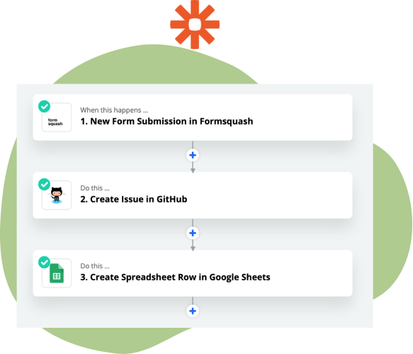
Next, we automated the requests with Zapier, so on every form submission on the website, we create a new issue on Github so one of the admins must review and approve it, then the spreadsheet and the website could be both updated with new data.
Outcomes
Here are some highlights after some months of usage:
More than 20 requests on Github.
Around 26 active users.
More than 900 accesses.
No more issues about outdated info or storage almost full.