Scaling design at Eventene
Nov 2018 ~ Jul 2021
Goals
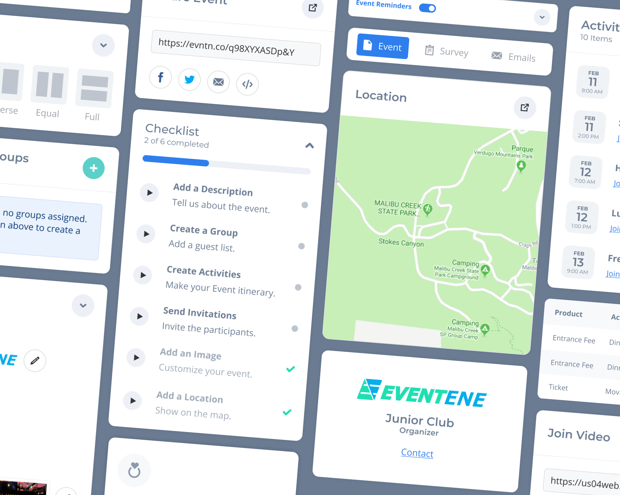
Improve the connection between the brand and products.
Create a nice handoff among design and development.
Organize and document every single UI element.
Context
Eventene is an event management system for creating, organizing and running events in a single platform.
Founded in 2016, Eventene released its first MVP (v1.0) product in 2018, and hired me to redesign the entire system for a 2.0 release.
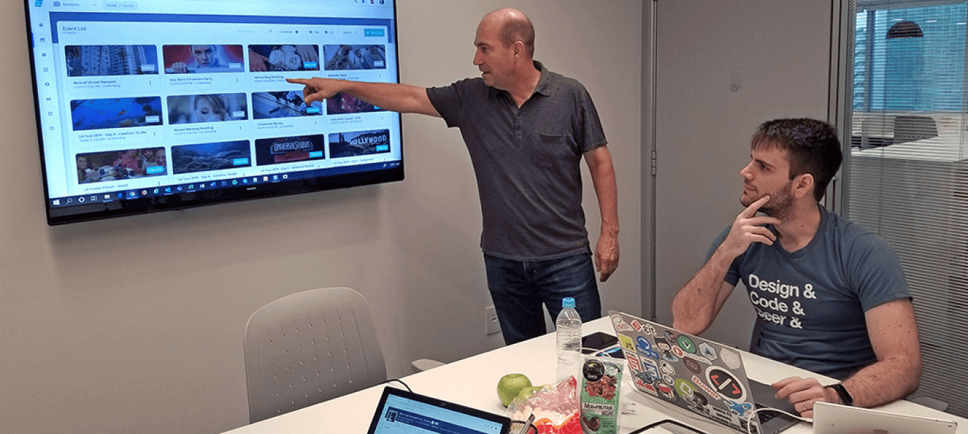
As a fully remote team, we held regularly scheduled online video meetings to discuss design ideas and development goals each week.
As a small company, it was possible to integrate customer feedback into our product design plans.
The Problem
The Eventene 1.x product was amazing. It had many useful features but some of them were hard to discover.
At the time, the company was not familiar with modern Design Principles. I therefore spent many months reviewing and completely redesigning the product.
To start, I updated their product branding, bringing modern color shades and applying gradients to stand out a bit more and giving a fresh look to the product.


Foundation
Each Eventene application received its own internal codename based upon an animal theme, such as "Bobcat" for the main app, signifying strength and robustness.
Their Mobile App was codenamed "Falcon" because it’s smaller and faster.
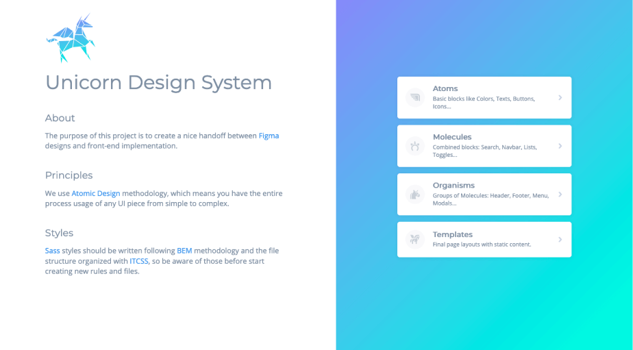
The design elements library used "Unicorn" as a reminder of a legendary creature and its relationship to fantasy.
To achieve balance and unity, we utilized Atomic Design methodology, which consisted of cataloging the UI components from basic to complex, analogous to hierarchical elements in chemistry.

In our model we had a slight difference through the steps, keeping the pages as templates so wireframes are only visible for designers, that way we could remove the friction for developers.
We also created a closer language by using the unicorn paradigm so the team can find which piece of the animal is missing associating that with the UI component.

Having that in mind we decided to use Figma to create the basic variation of each atomic level and then document and specify them in a static page.
Another reason to do that is to see all components behaving properly, since design tools are limited and not 100% responsive.
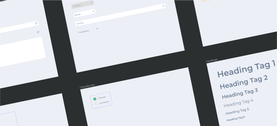
To start organizing the pieces in a web page our main references were Pattern Lab and Material Design. We liked the way to demo and organize components, although we missed the ability to copy and paste the styles / markup and see them running afterwards, which is handy for developers.

So we created a Github page centralizing and documenting all the UI elements, assets and patterns.
It’s also a static staging version of the main product so we can test before importing in real data products.
To prioritize the components, we essentialy based on most used pages according to analytics. So we broke down the basic elements from each one and started to reuse over others.
When viewing the details we tried to combine a flexible layout with an easy navigation, the component details, notes, code and demo.
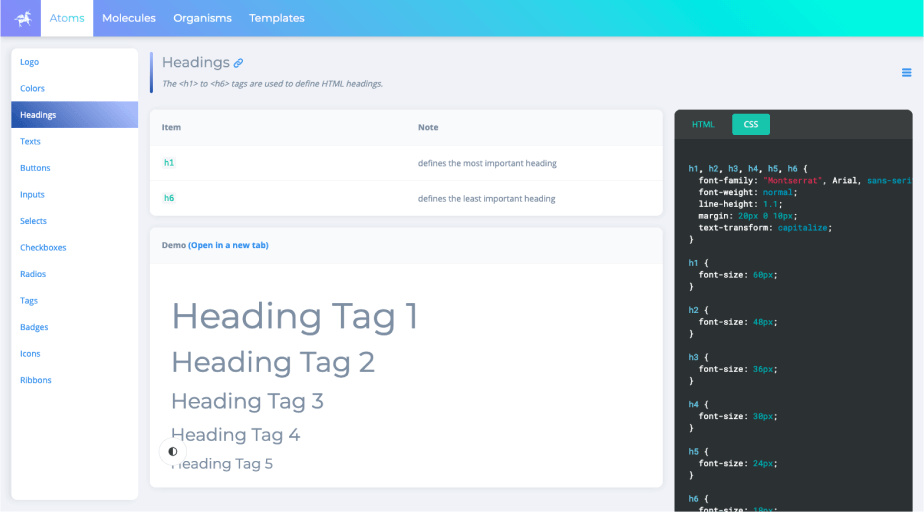
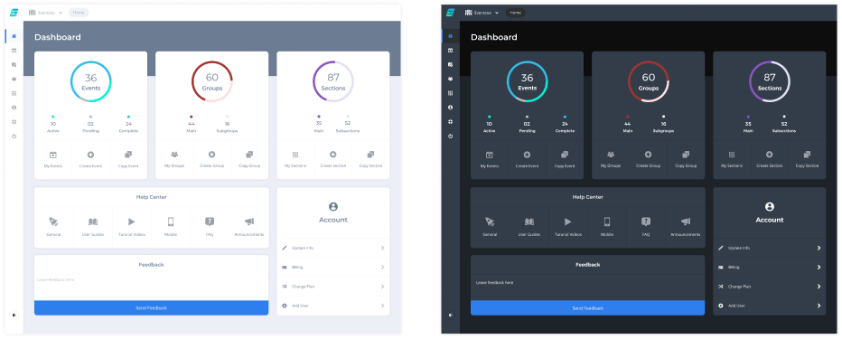
Opening in a new tab gives you the ability to have a full experience about the component behavior, its responsiveness, toggle between light and dark themes and if it’s a template you can even navigate through the pages statically.
Maintainability
When it comes to code we know how hard it is to keep things organized as it scales so we had to apply a few methodologies to not be overwhelmed and run in sync with the designs.
To organize files and folders we used ITCSS. Basically you draw an inverted triangle and slice it by folders as layers from low-specificity selectors to more specific ones and from generic styles to explicit ones.

Regarding the class names usage, we adopted BEM methodology and combining to Sass preprocessor it worked like a charm to find nested rules quickly.

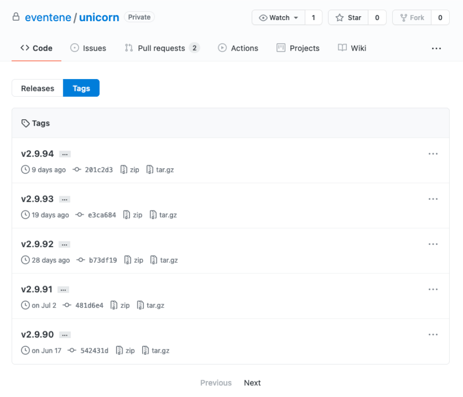
To use these styles across all the products we created a Github package and each new version we simply add a tag number. So if for some reason a page breaks that can be quickly rolled back to the previous version.
Outcomes
The team was able to work faster and more efficiently by using the new Design Principles and Unicorn design elements.
Shorter learning curves for new developers following the guidelines.
Eliminated inconsistent assets and elements throughout the product.